
The Emotional Impact of Colour Grading
The bridge between visual reality and emotional resonance in photography is built with the bricks of colour grading. Before the digital age, artists were limited by the constraints of film types and chemical processes. Early films like sepia-toned prints offered a warm, nostalgic aura. As technology evolved, so did the palette available to photographers, expanding their creative horizons.
The Complex Web of Colour Theory
The realm of colour is far more profound than just hues; it's a language that speaks to our emotions, memories, and experiences.
Reds: Think of the vibrant red of a fiery flame or the soft red of a loving heart. This colour can remind us of pressing moments, like a stop sign, or convey feelings of love, like a rose. Dive deeper into red, and it can signal danger or even challenge. It's like the warm embers of a fire that can both comfort and warn.
Blues: Picture the endless blue of the ocean or the vastness of the sky as evening sets in. Blues often make us feel calm and reflective. It’s like the cooling touch of a summer breeze or a soothing melody. Yet, the same blue can also bring feelings of sadness or longing, reminding us of the dual nature of life's experiences.
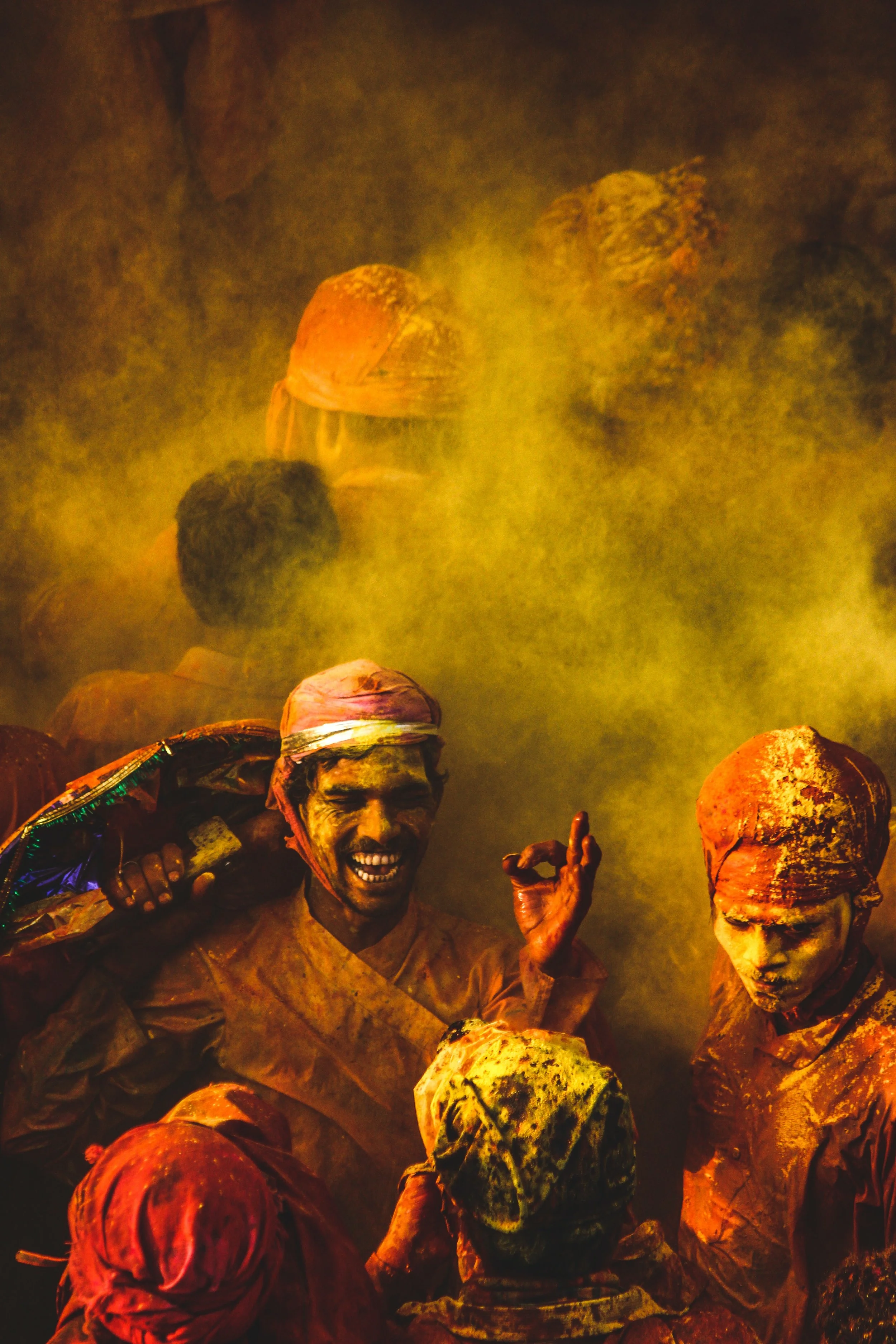
Yellows: Imagine the bright light of morning or the golden leaves in fall. Yellow is all about hope, happiness, and energy. It captures short, beautiful moments, like a shooting star or the fleeting bloom of spring flowers. Yellows are like life's constant reminders of change and growth.
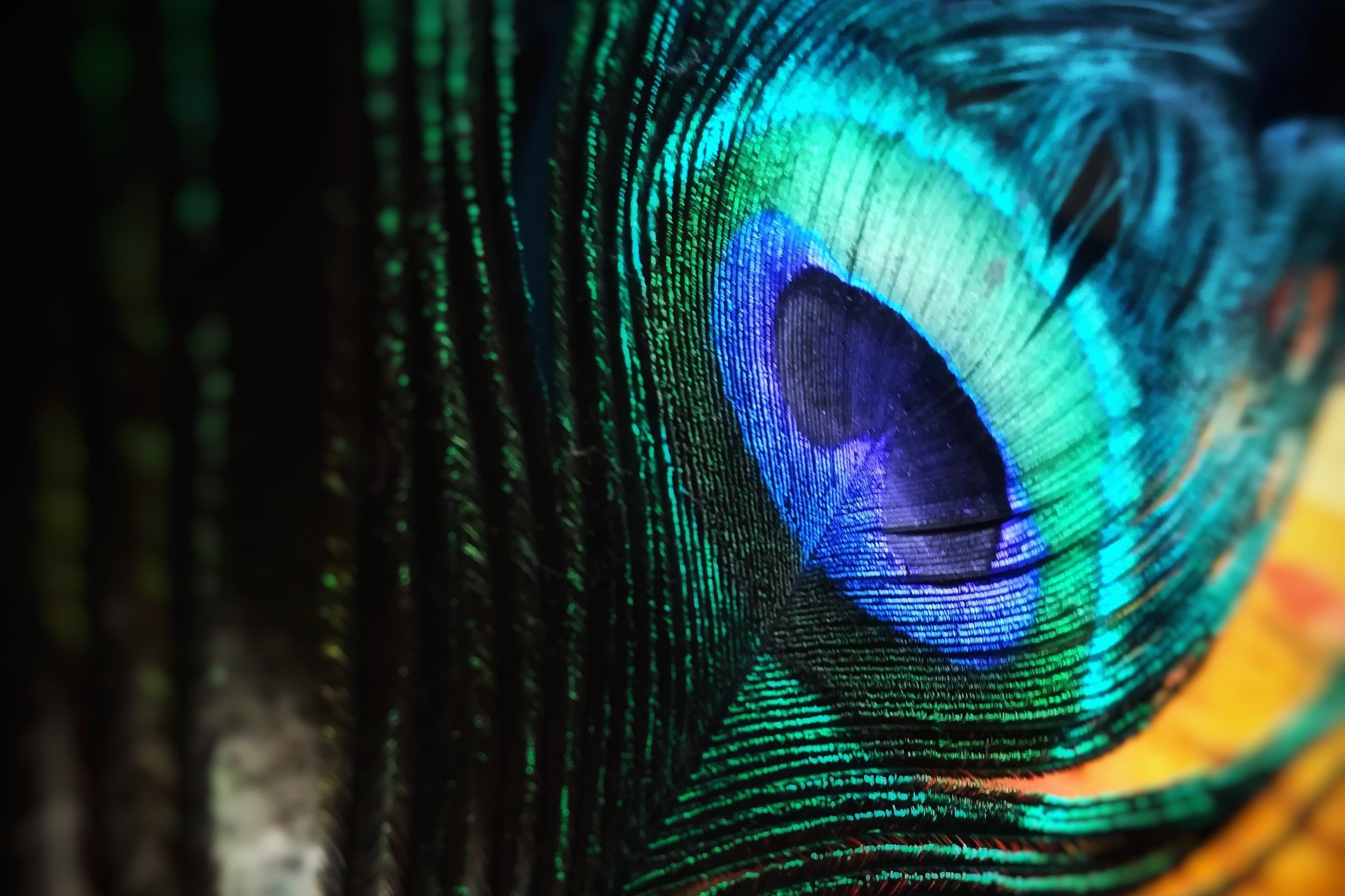
Greens: Walking into a forest, you’re surrounded by many shades of green. From the light green of young leaves to the deep hue of ancient trees, green symbolises life and growth. It brings feelings of peace, like a quiet walk in the woods, but also stirs curiosity about the mysteries that nature holds.
It's important to note that these reactions to colours are typical but not universal. Individual responses can vary based on personal experiences, and cultural contexts also influence how colours are perceived and interpreted.

The Colour Wheel
Central to understanding colour theory is the colour wheel, a circular representation of colours' relationships with one another.
Primary colours (Red, Blue, Yellow) are the foundation of all other colours and cannot be created by mixing other hues. Primary colours can be dominant and are often used to capture the viewer's attention. For instance, a bright blue sky or a field of sunflowers can evoke strong emotions. Secondary colours (Green, Orange, Purple) are formed by mixing two primary colours. For instance, blue and yellow yield green. These colours often provide balance in a photograph. Imagine the golden hue of a sunset sky blending into the purple of the twilight. Tertiary colours are the result of mixing a primary and a secondary colour. They offer nuanced variations and can add depth and subtlety to images. Think of the hues in a forest during fall, from reddish-brown to orange-yellow.
Complementary Colours
Understanding these colour pairs is pivotal for creating striking contrasts in photography. Complementary colours are those positioned opposite each other on the colour wheel. Their contrast is naturally high, which makes them stand out when placed side by side in an image. Examples include the red poppies in a green meadow, the orange tones of the Grand Canyon against a blue sky, or a blue boat on a sunset-lit orange sea. Using complementary colours can create a sense of harmony and balance in a photograph, making it visually appealing and guiding the viewer's eye to key focal points.
Colour Perception
To truly grasp the depth of colour theory, you must first delve into the realm of human visual perception. Colours do not exist in isolation; they interplay, changing their hues and intensities about neighbouring shades. Colours change when juxtaposed against others. For instance, a blue lake may appear richer when surrounded by golden autumn trees compared to when it's alongside snowy terrain. Note how blue and yellow are located opposite on the colour wheel. Variations in lighting further complicate these perceptions. The phenomenon of colours' relativity is not merely a quirk of vision; it's a cornerstone of effective colour grading.

The Power of Adobe Lightroom in Modern Photography
Today's photography has seen a transformation like no other. We've moved from the tangible art of manipuilating film in dark rooms to the innovative realm of digital tools and software. At the forefront of this revolution is Adobe Lightroom. Here are two of the tools I use to help colour grade my images.
Graduated Filters
The Graduated Filter creates a seamless transition between tweaked and untouched areas. It's a favourite for enhancing skies or foreground elements without overhauling the whole image. The Radial Filter is all about focused adjustments. Want to spotlight your subject or add a vignette effect? This is your go-to tool.
For skies, the Graduated Filter can introduce cool tones. Think about adding shades of blue or purple to bring out the depth of a sunset or to add a touch of mood. Use the Radial Filter to highlight your subject. Warm tones can be the centre of attention, with cooler ones fading out to the edges.
HSL Sliders - Hue, Saturation, Luminance
Want to change the colours subtly? The Hue slider can turn a regular sky into a teal dream or make green leaves look like they're touched by autumn. Saturation is about colour intensity. Boost it to make your sunset pop, or dial it down for a softer, more nostalgic vibe. Luminance allows you to play with the brightness of specific colours. Darken the blues for a deep sky or lighten the yellows to make a field glow.
Evoke emotions with your choice of hue. Go warm for feelings of energy, or cool it down for a serene touch. The mood is in your hands with saturation. Crank up the saturation for a lively scene or tone it down for calmness. Luminance allows you to bring harmony by brightening colours that should stand out and toning down the rest. Think of bright yellows contrasted against subdued blues.

Demystifying the Grading Workflow: A Step-by-Step Guide
By following this systematic approach and with practice, you not only enhance your image's aesthetic appeal but also ensure its essence remains intact. Here’s the workflow I typically use to ensure that my photos stay true to vision.
1. Initial Assessment: Assess the Image's Soul
Before diving into edits, spend a moment to immerse yourself in the photograph. What story does it tell? What emotions does it evoke? This reflective step ensures that subsequent edits enhance the image's core message instead of detracting from it.
2. Basic Corrections: Lay a Strong Foundation
Just as a house needs a solid base, so does your image. Start with correcting any noticeable flaws. Straighten horizons with the cropping tool. Adjust exposure to achieve a balanced luminance. Correct white balance to ensure natural colour tones. Remove unwanted artifacts or distractions.
3. Tonal Dynamics: Play with Lights, Mids, and Shadows
The tonal range can dramatically influence how an image is perceived. Adjusting the highlights (brighter portions) can bring out details in clouds or reflections. Tweaking mid-tones can accentuate or soften facial features in portraits and bring depth to landscapes. Deepen shadows for drama or lighten them for a softer feel. It's all about creating contrast and depth.
4. Selective Color Alterations: Choose Your Colour Palette
Colours play a vital role in setting a photo's mood. With targeted adjustments, you can make specific colours pop or recede utilise the HSL sliders for precise control over individual colours. Enhance the vibrancy of a sunset, or mute certain tones for a vintage look.
5. Overlay Moods with Split Toning: Craft Layered Emotions
Split toning allows for simultaneous colour adjustments to both highlights and shadows, crafting a nuanced emotional response. Add a golden hue to the highlights and a deep blue to the shadows for a nostalgic, sepia-toned image or perhaps a pinkish hue in the highlights and teal in the shadows for a trendy, cinematic feel.
6. Finalise: Sharpen, Refine, and Present
You're almost at the finish line. Before presenting your work. Sharpen the image slightly to enhance details. Consider a subtle vignette to guide the viewer's eyes to the subject. Double-check the entire process, ensuring that the edits serve the image's initial story and emotion. Export in the desired format, resolution, and colour profile for optimal viewing.

Beyond Artistry: Ethics in Colour Grading
In the world of photography and digital art, colour is more than just a tool; it’s a language. It has the incredible capacity to evoke emotions, tell stories, and transport viewers to another time or place. But with this power comes a significant responsibility.
The Double-Edged Sword of Manipulation
While colour grading can enhance images, it can also distort their essence. Over-manipulated images can misrepresent their subjects, which can be problematic, especially in photojournalism where authenticity is crucial. But even in more artistic contexts, there's a fine line between enhancing an image and misrepresenting the world it captures.
The Responsibility of the Artist
Every artist has the right to creative liberty. It's what allows for innovation, exploration, and the continuous evolution of the medium. When presenting work, especially in a commercial or journalistic context, it's crucial to be transparent about the level of manipulation involved. This doesn't mean stifling creativity but rather ensuring that viewers are not misled by the final product.
Balancing Creativity with Authenticity
The challenge lies in balancing the desire to create a compelling image with the need to remain true to the scene's original essence. It's possible to use colour grading to bring out the beauty in a photograph without resorting to extreme alterations that distort reality. Such a balanced approach respects the integrity of the scene while allowing the artist to impart their unique vision and perspective.
Conclusion
Crafting Visual Symphonies in Travel and Landscape photography, at its heart, is an emotional endeavour. In travel and landscape photography, colour grading is the final touch of storytelling.